If there’s one thing the COVID-19 pandemic has proven so far, especially for nonprofits, it’s that having an online presence is no longer something that’s just nice to have. It’s a must-have feature that should be a priority for your organization if you want it to survive another year.
The good news is that it’s easier than ever to launch a website these days. There are many companies out there that promise you they can help you design a website in less than 10 minutes.
You could also go the cheap route and find a discount web designer to get your organization online. But remember this: just because you have a website, it doesn’t guarantee that you’ll be able to increase your impact in the community or the amount of donations coming in.
The best way to make sure your website has the biggest impact—during COVID-19 and beyond—is to make sure you’re practicing good web design. A good website design will make sure your nonprofit reaches the maximum number of people and converts onlookers into supporters who will keep coming back to your website and help build your movement.
How you do make sure you nonprofit’s website has the best design but doesn’t cause you to feel overwhelmed, especially if you don’t have full-time web design team on your staff? You get inspired by other nonprofits with well-designed websites.
So when I heard the Equal Justice Initiative won a Webby Award for best nonprofit website, I knew there was going to be an opportunity to show others what good nonprofit web design looks like.
Let’s do a breakdown of what makes the Equal Justice Initiative’s award-winning website work so well.
Homepage
The visualization and messaging around the organization’s core programs on the homepage are subtle and minimalist, but they were done really well.
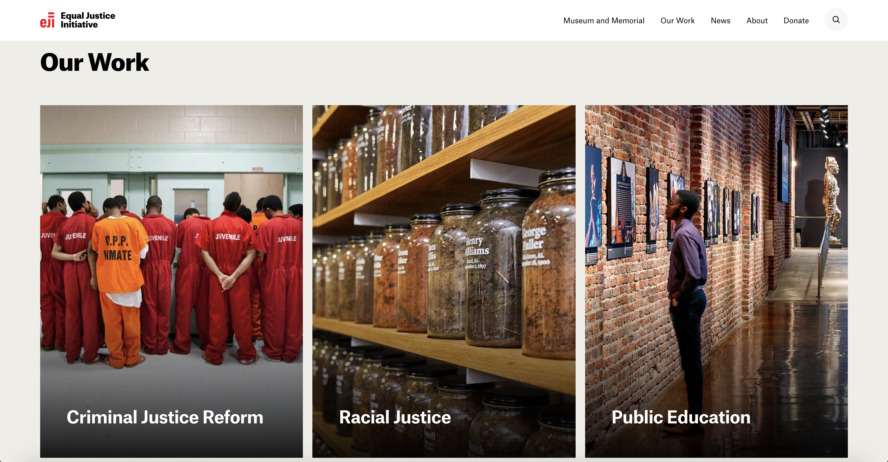
You can tell there are many projects the organization is working on simultaneously, but all their projects can be summed up by three main issues: criminal justice reform, racial justice and public education. By grouping everything under these three mani issues, it’s clear to the audience what the organization stands for and what a visitor would get into if they chose to explore more of the website.
The issues are broken into three columns and take up the full width of the page (this is becoming more of a trend with web design), and each issue is accompanied by a real photo, not a stock photo (this is really important and I’ll explain it in a moment).
When you hover over the title for each issue, an excerpt is revealed that explains more about the issue and the organization’s theory of change. This is a nice touch, it’s simple and it looks professional.
Next, the organization has decided to highlight some of its featured projects. Again, they do this with strong photos taken by a professional photographer.
They have a call to action further down the page where they’re encouraging people to visit their museums. The Memorial for Peace and Justice in Alabama is world-renowned and, if you’ve heard anything about Bryan Stevenson, then you know about that museum. So you’ll be drawn to that call to action.
I really like their donate section at the bottom of the homepage. It’s simple but impactful. They clearly tell the potential donor what the organization does to advance their cause and they remind folks that they’ve been recognized by some well known institutions (social proof is everything nowadays).
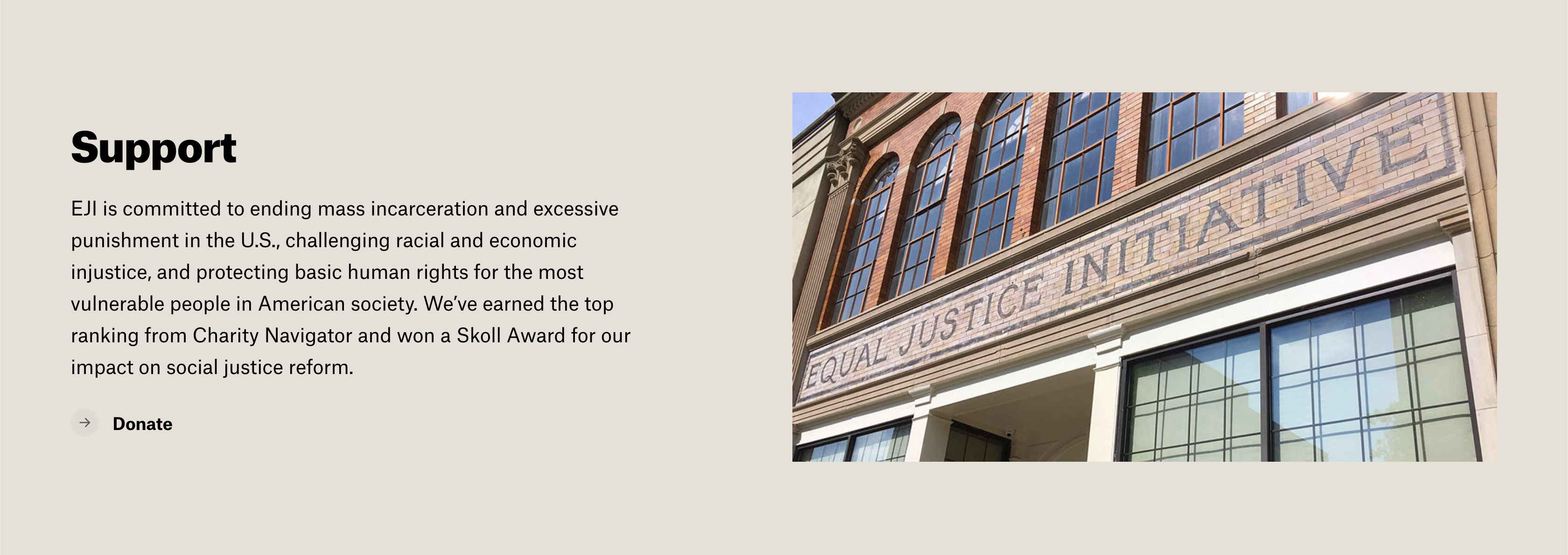
I also like the background colors. They’re not sticking with the traditional white background. They chose a light beige background throughout the site and different sections are separated by a different hue of that beige color. Everything is clean and subtle.
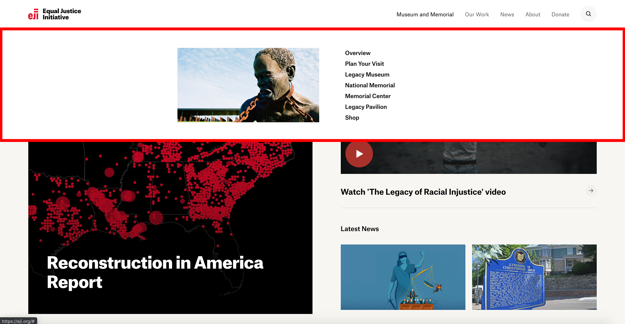
Also take note of the navigation menu. You’re seeing more websites use the mega menu design, which works best if you have a lot of sections throughout your website. The menu is clean and, like the rest of the website, very visual. Nicely done.
Inside Pages
The design of the inside pages is what really impresses me about the website. Although the homepage is few on words and storytelling, the inside pages are filled with perfectly crafted copy.
Just take the opening paragraph on the Criminal Justice Reform page.
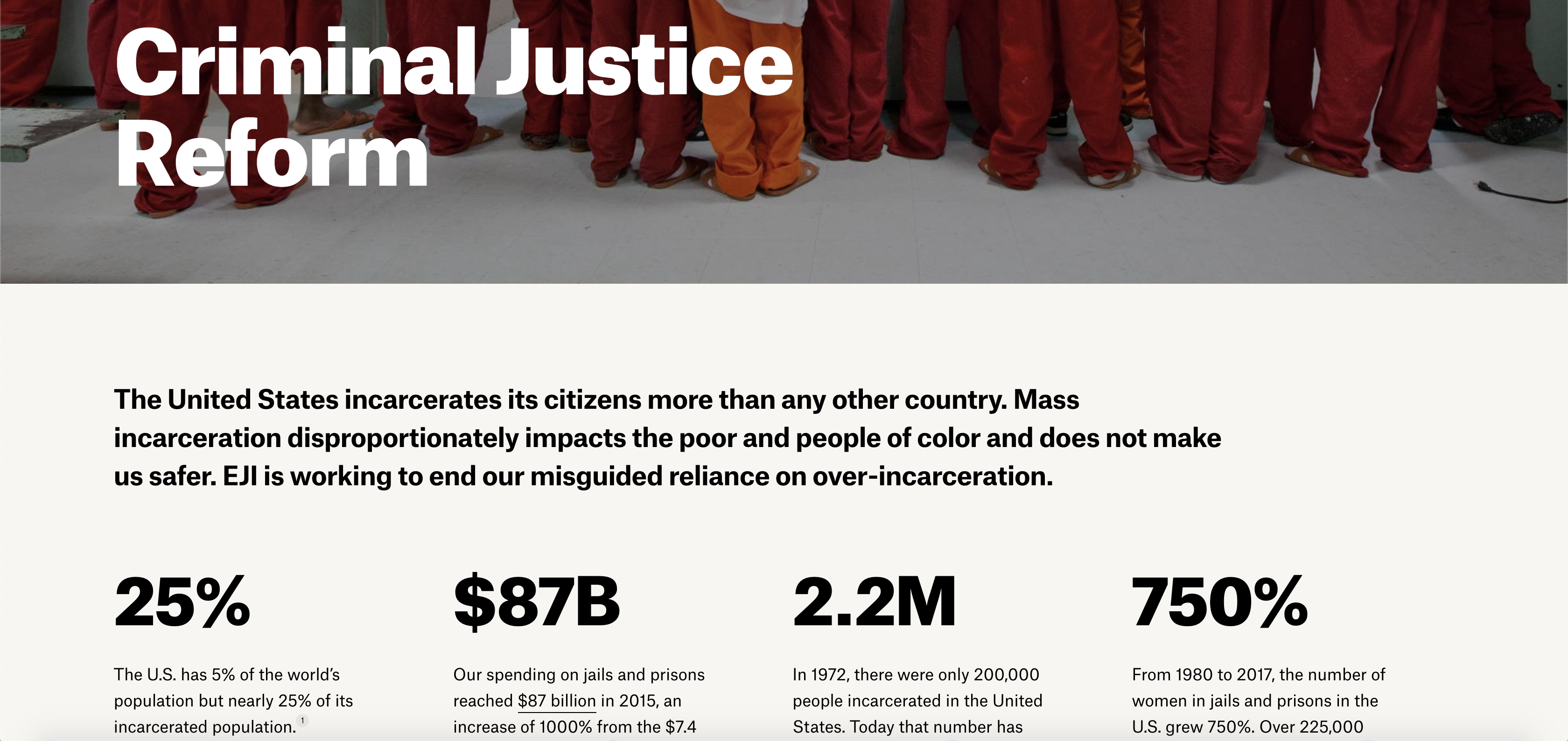
They talk about the problem they’ve identified (mass incarceration), how that problem has created injustices in our society and what they’re doing to reverse those injustices. It’s a common formula used to frame many social justice messages, and it works.
I like how they highlight the numbers in big bold font to show the statistics that back up their work. This is way better than showing a graph or just linking to a report.
Further down the page, they tell another story about how the American criminal justice system favors profits over people. Then, if you want to learn more about the issues they’re fighting for, they’ve listed them toward the bottom of the page.
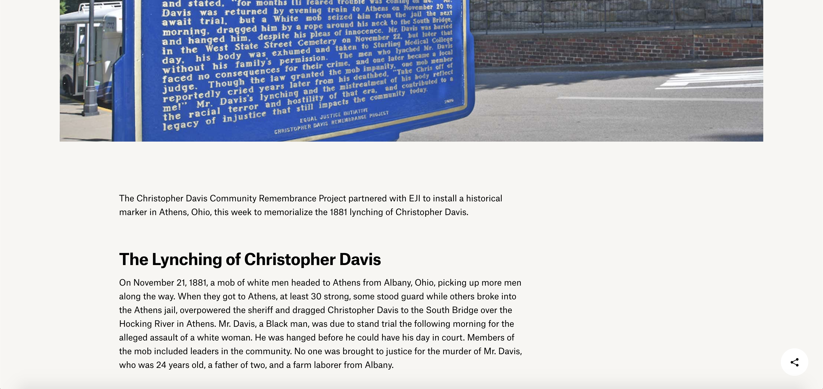
Each section is accompanied by a real photo, and some sections highlight real people’s stories.
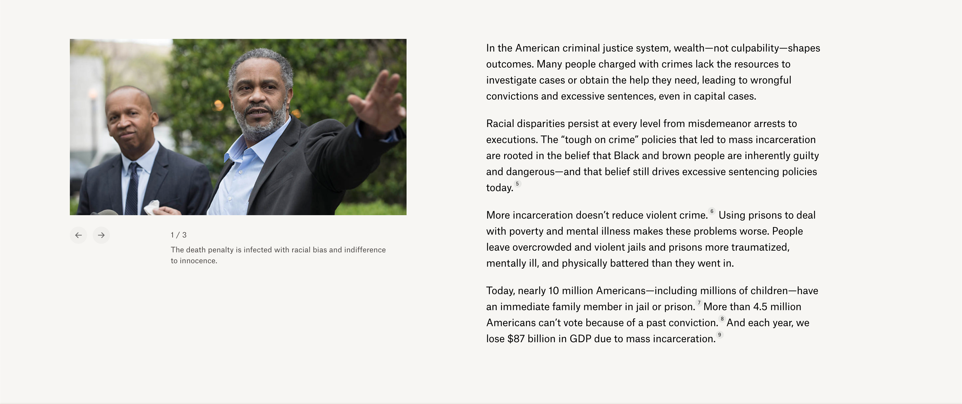
Let me just take a moment to share why it’s so important to use real instead of stock photos on your website. While there are literally millions of realistic-looking photos available on all the major stock photo websites, many of them will not be able to capture what’s really going on in your community.
Oftentimes, I’ve found that people in the nonprofit space favor stock images because they’ve gone months (sometimes years) without documenting their work in the community. It’s also a cost issue to some people.
Let’s face it: You might be able to spend maybe $100 and get all the stock images you need to fill space on your website. But it will cost you a lot more down the road when people visit your website and don’t see their community reflected in the visuals, so they never come back.
While hiring a professional photographer or videographer might seem like a huge expense at first, it’s worth the investment in the long run. That’s why, on every page of the Equal Justice Initiative’s website, you’re going to be inspired to take action and join their movement.
What’s more, the layout and storytelling done for each page remind me of a slick magazine article, and that’s why I think the Equal Justice Initiative website is one of the best nonprofit websites on the web right now.
When you’re coming to a nonprofit website, you’re expecting to be inspired, educated and moved to take action. But you don’t want to be bashed over the head with a textbook’s worth of information and you don’t want to be left confused because the organization hasn’t properly explained what they stand for and what they do in the community.
This website has a nice balance and, just like with any feature magazine article, it makes you want to share with family and friends. That’s what every nonprofit should aspire to accomplish with their website.
Other Inspiration
I also like how, on their blog, they don’t use a sidebar but keep the spacing on the right side of the screen for better readability.
I also like how they’ve done their photo galleries. There is spacing on the left and you’re invited to scroll to the right to see more photos.
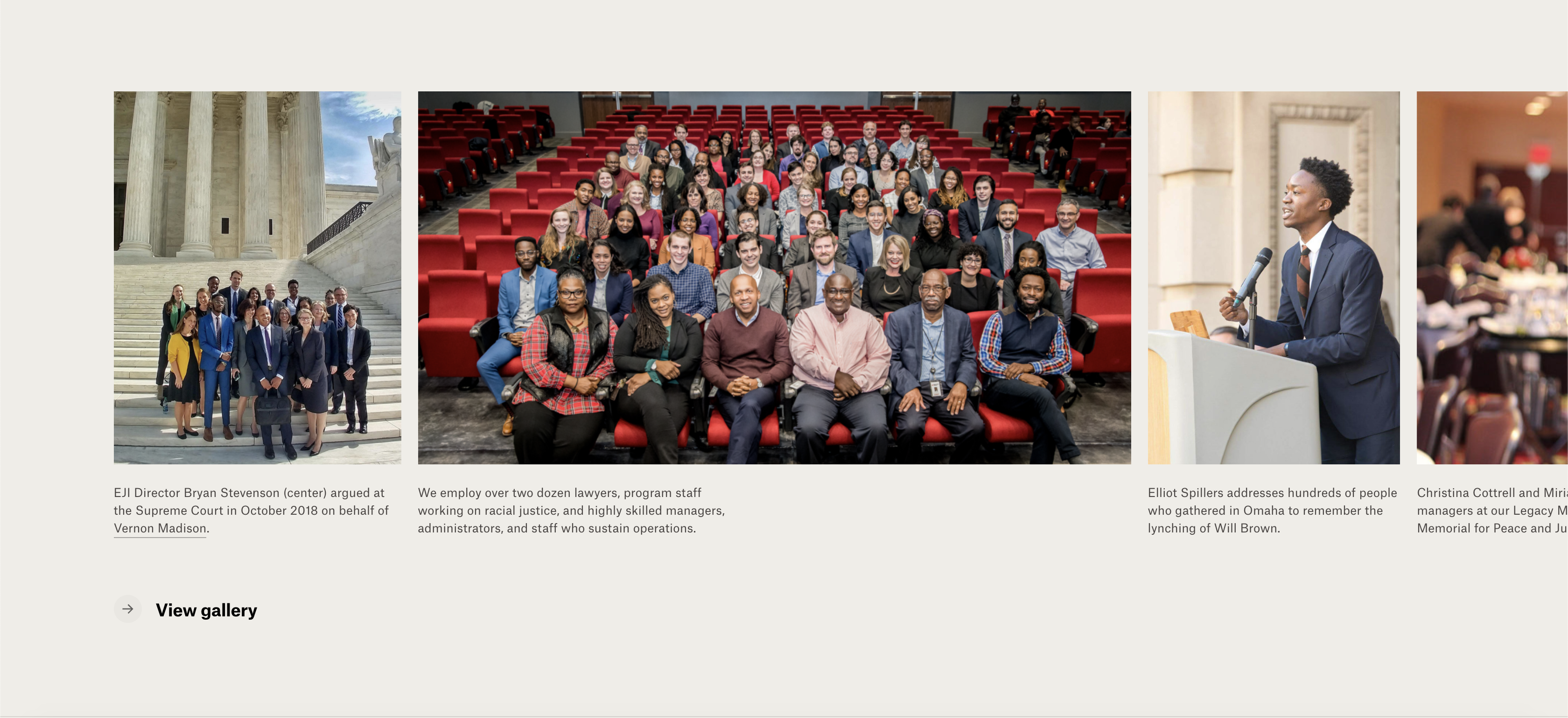
It’s a subtle way of getting people to stay on the page and click for more information throughout the website.
Steal These Ideas
To sum up what makes this website stand out from the rest, here’s my observation and how other nonprofits can model what the Equal Justice Initiative has done:
- Use clean, minimalist design to let your content shine
- Use real images taken by professional photographers (not stock images)
- Weave storytelling into your copy to explain your issues and hook the visitor into your movement
- When possible, visualize any numbers you have to back up your issues
- Highlight real people you’ve helped in the community (social proof has become the new SEO)
- Use good fonts and sizing (don’t be afraid to purchase a special font or two to make this happen…just be sure they’re web-safe)
- Incorporate your organization’s branding into the donation page and include an FAQ section on the page (I’m seeing more of this nowadays and I would highly recommend putting the same type of FAQ section on your donation page)
- Keep the same look and feel on every page (it makes it seem like every page was intentionally designed to represent the organization’s mission and it shows the visitor you’re appreciative of their time)

